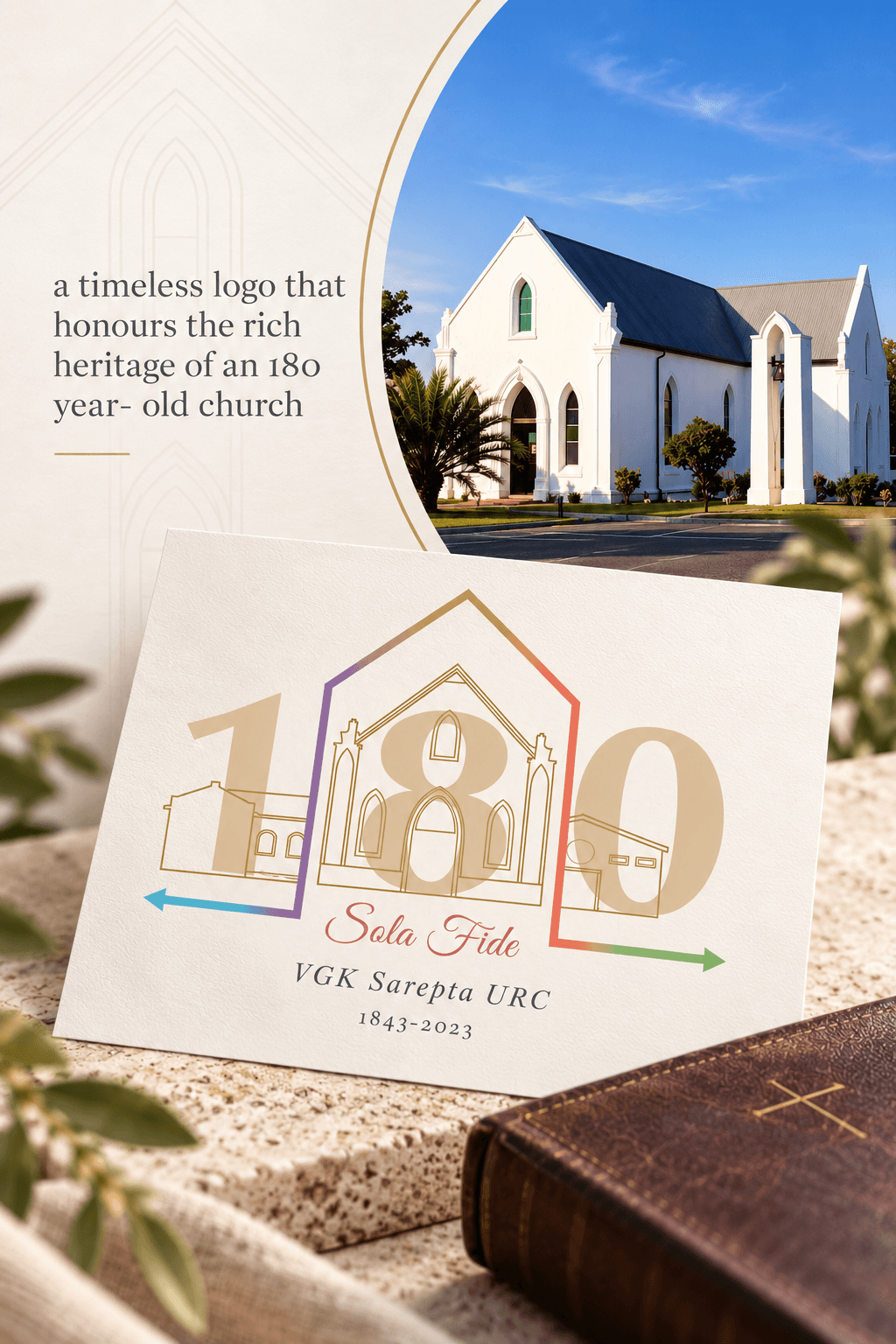
URC 180th logo
a timeless logo that honours the rich heritage of an 180 year- old church
Year
2023
Scope
Logo Design
Client
URC Sarepta │ 180th anniversary
Duration
3 weeks
A timeless commemorative identity celebrating 180 years of VGK Sarepta URC. The logo brings together the congregation’s three church buildings, liturgical colours and historic architecture, creating a visual connection between its past, present and future.
Challenge
How do you capture 180 years of history without creating an identity that feels dated or overly complex?
The church’s story spans generations, multiple buildings and a rich liturgical tradition. The challenge was to represent these meaningful elements while creating a logo that remained recognisable, cohesive and versatile enough to work across both ceremonial and everyday applications.
Solution
The three church buildings were translated into refined architectural linework and integrated into the 180-year mark, allowing the congregation’s physical history to become part of the identity itself.
The surrounding linework tells a deeper story: an arrow pointing backwards acknowledges and gives thanks for the past; the line rises upward toward God, the central point who has sustained the congregation throughout its journey; and the forward-facing arrow represents faith and hope for the generations still to come.
The addition of the liturgical colours further connects the identity to the life and traditions of the church, resulting in a logo that does more than commemorate 180 years — it tells the story of where the congregation has been, who has carried it, and where it is going.